


THE MITTEN (A long, sad saga)
Years ago I was commissioned to produce a new version of the classic tale ‘The Mitten’ and I thought I should write about it here as it shows how projects can go awry despite our best efforts. This is work I’m really proud of and a book I really believe in despite the fact that it is sitting in a drawer of my plan-chest awaiting a miracle.

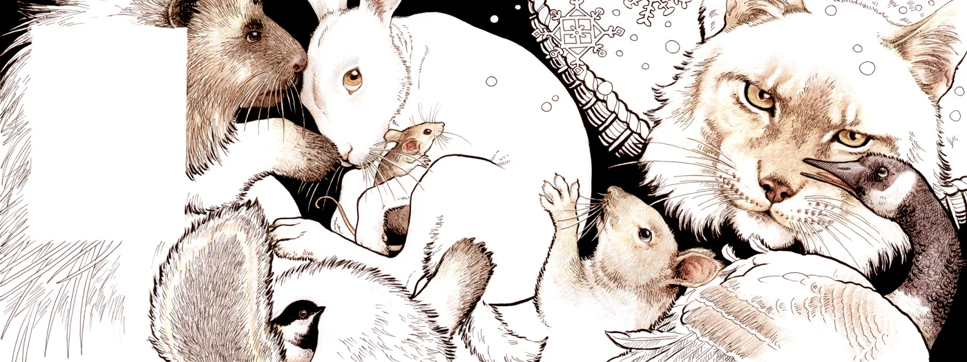
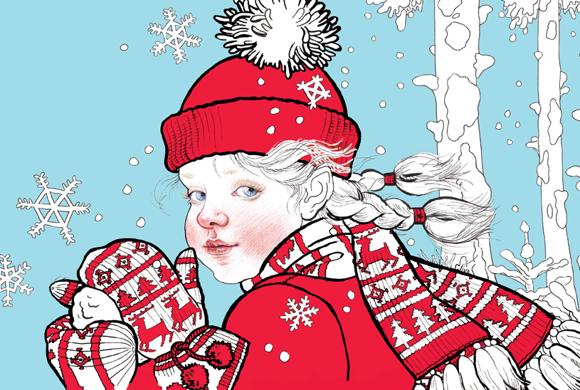
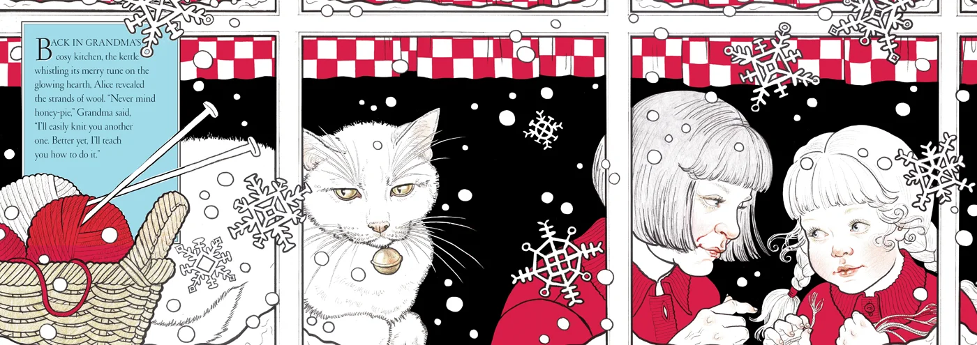
When I was asked to come up with my own version of what is a well known story, (and with a long-standing best-selling edition by Jan Brett already on the market), I decided I needed to explore a totally new way of working (pointless to put another highly-worked version in direct competition). I have mentioned before that a couple of art directors thought my work ‘too serious’ for younger readers and this was an ideal opportunity to try and address that so I set out to produce something simple and bright. Knowing my tendency to just keep on adding detail I picked up some felt-pens, (usually dismissed as a child’s medium), which meant making bolder, freer marks. Because the story is set in the snow I chose a very limited colour palette—red and black on white—which would very definitely set it apart from Jan Brett’s.

The opportunity to draw the stars of the story—the animals—was such a rare pleasure for me and I intentionally worked quickly so as not to become ‘too precious’ about the marks I was making, relishing the spontaneity and freedom the felt pens gave me, adding a little coloured pencil here and there (can’t resist those details!).


The initial reaction to the drawings was very favourable and I congratulated myself on discovering a new method that could potentially open up my work to a wider market, something I strive for all the time. However (and I have found this often happens to work I am particularly pleased with and which is particularly difficult to deal with) the more people who saw it and the nearer it came to being published, the more the lack of colour became a problem. I don’t know about you, but I am always drawn to work with a restricted palette or even no colour at all, as it stands out against its surroundings and yet I often suspect that the industry is heavily prejudiced against such pieces. On what grounds? Children only like lots of bright colour? I don’t think so. Buyers are only attracted to lots of bright colours? Again, I don’t think so. Anyway, I was asked to add more colour, which I was really loathe to do, but eventually decided that by adding one more strong colour I could give the impression of more colourful pages. I thought a particular blue when added to the red would look somewhat Scandinavian and therefore still ‘wintery’.


I was eventually reconciled to the changes and still excited to see the book in print but sadly there were more snags as time went on. The ultimate client was a large US book buying chain (Border’s) that was undergoing financial difficulties and as a result were changing staff at an alarming rate, and at each change of guard ‘The Mitten’ became entangled in more and more political upheaval. In the end the company went bust and ‘The Mitten’ was left high and dry.
Several years went by and several successful books; Dracula, Robin Hood, Snow White etc. but I couldn’t give up on ‘The Mitten’. The rights to the illustration were eventually returned to me, which meant rewriting the text so that I had full copyright control—it is a very simple story based on a Ukrainian Folk Tale so it wasn’t too difficult to do.


Looking at it afresh, and changing the story a little, still meant redrawing some of the spreads though it retained its ‘North American’ and contemporary setting. And this is where it stands now. I still believe wholeheartedly in this book but how to get it published? Perhaps this is where I take the plunge and self-publish? I don’t think there’s much point in digital publishing as such as how to make it stand out amongst the many thousands? I think it has a possible future as an interactive App; I have explored the possibility of commissioning an animator and getting my good friend Christopher Aslan to be the narrator and think it may be worth the investment. The simplicity of the story and illustrations lends itself to quite limited animation that would add an interactive element, so ‘value-adding’ which is always an asset.

This would be a totally new departure for me and I do believe it is something all illustrators should be exploring if only to release us from the ever-tightening strictures of mainstream publishing—I only wish I was young enough to learn to animate for myself! Take heed all you young illustrators—learn how to animate! Alternatively I have been looking at very small-edition publishing where a ‘hand-made’ element is usually added. My initial sketch had a mitten-shaped embroidered book-bag that would be feasible in very small numbers, or I could look into a hand-bound hand-printed version. Back at the beginning of the project I had a friend, Sue Taylor, draft a pattern for the mitten in my illustrations and knit it for me—it struck me that with a resurgence of interest in knitting it might be something ‘Granny’ might like to do and so ‘value-add’.


So that is where it stands. I’ve given it a new title and it’s now called ‘One Snowy Night’ just in case that removes the jinx that’s been hanging over it. Should I ever have enough funds to hire that animator I think I would like to explore the App option. Fingers crossed.


Nelly (continued)
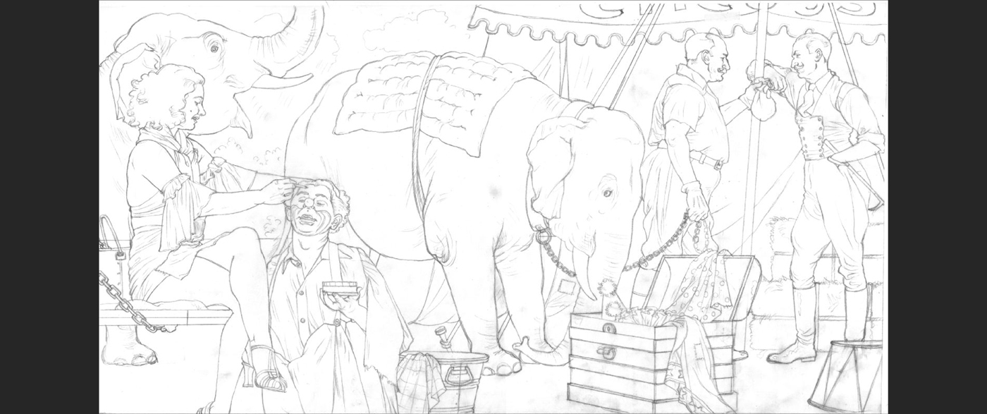
It’s been some time since I’ve been able to get back to ‘Nelly’ (at this rate I hope I have enough years left!) but here is another spread. We have reached a very sad episode in Nelly’s life where she is sold away to another circus much to Lucy’s distress and here is the spread developing from line stage to Danny’s typography.


Red Canoe (work in progress)

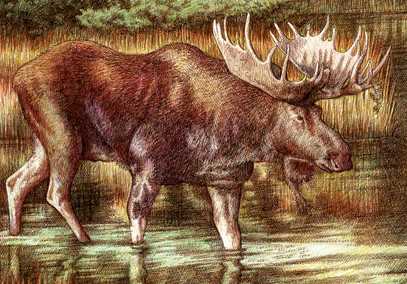
I arrived in Toronto 6 years ago and fell in love with all things Canadian—not just my husband! Toronto is a great city to live in, hip, vital, creative; moreover it has been my privilege to make friends with great Canadian illustrators like Anita Kunz, Blair Drawson, Gary Alphonso and Sylvie Daigneault. However it wasn’t until I visited Algonquin Park that my eyes were truly opened to the real nature of this vast country. It has been many centuries since the UK had large tracts of virgin forest complete with indigenous wildlife therefore I am used to a tame, though splendidly picturesque, countryside where bears and wolves were hunted to extinction many centuries ago. My goodness, is Canada different?
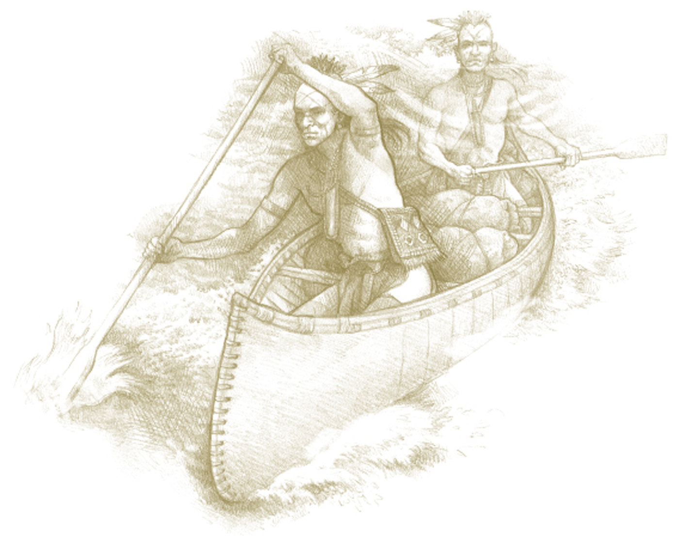
I have become fixated on canoes. My first attempt at paddling across a quiet lake was pure delight—really surprising as I am not ‘sporty’ at all and am quite terrified of water! In my mind’s eye I have returned to that image over and over again—the rippling lake, the overhanging trees perching precariously on granite cliffs—so much so that I wanted to write about it, hence ‘The Red Canoe’.
My story takes us back in time a little to when a young boy and his canoe explored the lakes and waterways together—and rightly or wrongly, I have written it from the canoe’s point of view as it lies neglected and disintegrating long after the boy has gone. I wanted a sense of Canada’s history—young as it is—as I am fascinated to learn about the country that has become my home. So far I have produced only three illustrations but my story is complete (though unedited) and I have attached it here in full. So far I have only written for myself, lacking the courage to show my stories to anyone, but I so believed in this story that I submitted it to Canada Writes and (to my utter astonishment) was placed within the 12 runners-up!
For the artwork I wanted to invoke not only the beauty of the natural surroundings but also a sense of time long past so my first piece was an exercise in choosing a colour palette as well as deciding how to depict the boy. I made use of quite a straight forward drawing technique so that the medium would not interfere with the viewer’s participation—sometimes the artwork can distract attention rather than enhance. I would have dearly loved Gary Alphonso to illustrate this story, as his work is so quintessentially Canadian, but it was a bit much to ask for such commitment when as yet I have no publisher.
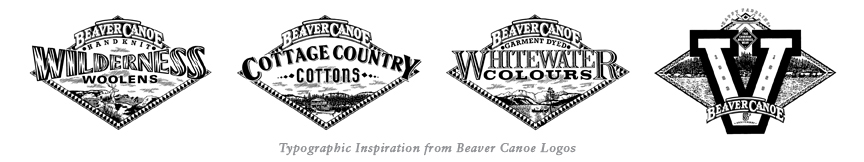
My talented husband Danny has been called upon yet again to do the design work and has produced a beautiful cover that hearkens back to simpler times. Some time ago, when still in advertising, Danny worked on the ‘Beaver Canoe’ account and we both thought that the graphic approach he used then was a good jumping off point for the overall look of ‘The Red Canoe’.


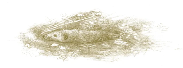
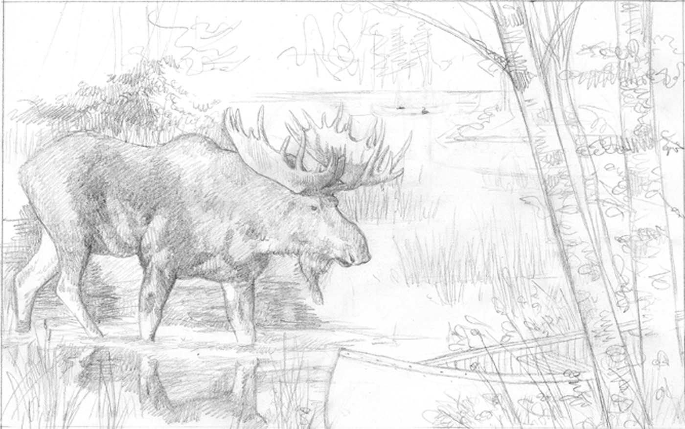
The interior of the book continues with the soft, natural palette and will include rough pencil sketches of plants and animals alongside the text—I think this helps to give it the old-fashioned appearance we’re looking for. Danny’s use of an overall background colour to soften the stark whiteness of the pages gives the whole thing a gentle, atmospheric look.


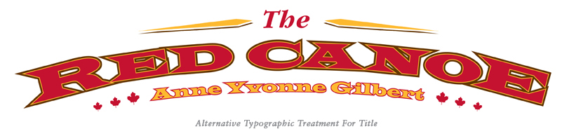
The Red Canoe
Copyright © 2013 Anne Yvonne Gilbert
The old boathouse stood gamely in the weak winter sun, it’s wooden sides creaked and groaned as if it shivered in the frigid air. Slivers of light squeezed through its missing planks and lit on the dusty webs and shrouded shapes lying in the shadows.
Behind the old wooden chairs and under the rusted tools, wrapped in stiff folds of canvas like an ancient Mummy, lay the old red canoe. Turned keel up it lay silent and forgotten, its fragile ribs grown brittle with age, its once gaudy paint faded and peeling.
Generations of mice had nibbled holes in its canvas sides while the fall before last a family of raccoons had taken up residence under it’s hull, its sheltering planks providing safety and warmth through the harsh winter months. Time moved slowly, days turned into weeks and weeks into years and the red canoe slept on. And as it lay there, it dreamed.
It remembered the summer day, long ago, when it left the place where it was built, when lifted from the ranks of fellow canoes, red and green and yellow, it was loaded onto a high wooden cart, its glossy red flanks gleaming in the sun. Swaying to the rhythm of the big horse’s steps the cart rattled along the rutted lanes till it came to the cottage by the lake. Remembered also the boy with the smile on his face who couldn’t wait for it to be offloaded but jumped right into the cart to be the first to touch it and stroke its sides.
From that moment the boy loved his canoe. The very first day they launched into the lake together and every sunlit day after that. The boy was quick to find his balance kneeling in its belly; the canoe wondering at the ripple of cool water against its sides weighed the feel of the boy balancing in its bows. Together they explored the mysterious ways of water, how it rippled playfully on breezy days rocking them gently on its waves then bounced and splashed down the tumbling creeks sending them rushing madly through the rocks. They learnt of its strength as it pushed back against their paddles or lifted them effortlessly on a wave, and that it had moods that depended on the weather.
Together they explored the lake with it rippling, deep green water finding all its hidden bays and shores and laying claim to each one. Camps were built and fires lit, on warm nights a bed was laid under the stars. As each summer day rolled into the next they learnt the secrets of the woods and waterways—where the beaver built it’s lodge and how many cubs were born, where the moose brought its calf down to drink in the cool evenings and where the heron liked to dive. They learnt the best spot to lay down the lines and fish, drifting dreamily under cloudless skies aware of how lucky they were.
Each year the boy got bigger and stronger and they travelled further and further, the canoe’s belly packed with supplies. They left behind the stories and games of childhood, the youthful heroes—Rob Roy and Davy Crockett, Robin Hood and Ivanhoe, and learned instead to portage between the lakes and navigate long distances by compass and stars. Summer at the lake was a magic time where a boy could grow strong and tall with sturdy limbs and a level head.
Time passed and the seasons changed; each fall the boy lovingly repaired any damage to the red canoe, cleaning and waxing repairing any scrapes, then carefully he would wrap it in soft, dry canvas tucking in the corners and making it tight. Snug and safe in the boathouse the canoe would dream away the winters while ice froze the lake and hung from the trees, while the brown bear slept in his cave and hungry wolves howled through the woods. Each spring the doors of the boathouse would creak open and the boy would carry the canoe into the open removing its covers allowing the sun to warm its flanks, waking it from its long sleep.
It should have gone on forever. But one year tales from abroad left the boy restless and unhappy; a War was being fought in far off lands by other boys just like himself. He could not settle to roam and fish when other boys were marching into battle, laying down their lives like heroes of old; he could not ignore the stir of his blood and dreams of chivalry and bravery in the face of death. So he went away.
The red canoe, packed away in the boathouse, waited for the boy to return. Waited for the spring day when the doors would open and the boy would carry him out into the sunshine once more. But the boy did not return. Like so many other boys in those terrible years the boy was gone forever. The red canoe waited a long time. It waited while winter turned into spring and still no boy; he waited as many winters turned into more winters. Endless years went by, the world beyond the boathouse changed in so many ways; electricity and indoor plumbing, radios and talking pictures, skyscrapers and telephones. The lake and the forest continued the endless cycle of birth and rebirth, while inside the canoe slept on, the dust settling on its painted skin, and mice making nests in its ribs.
The last winter had been the hardest of them all. The old boathouse offered almost no protection against the ice and snow and the canoe felt its life fading slowly away, its memories so old and faded they barely existed. Patiently it had braced its old cedar hull against cold and decay, the sharp little teeth, the clambering paws but now it felt the last of its strength seeping slowly into the shadows. It tried once more to remember the boy’s smiling face and the warm summer lake but it all seemed too much effort.
The old canoe lay as cold as a stone, the last memory fading away when the boathouse door opened, creaking loudly on its rusty hinges. There was a lot of banging and clattering and voices raised in excitement, A little boy’s voice shouted “Dad! What’s this?” and the old canoe felt itself lifted out into the sunshine while eager hands busily removed the dusty old canvas. “It’s a canoe Dad! Look at it! It’s beautiful Dad—can we fix it?” “Sure son,” came the answer “Sure we can.” And the red canoe felt the warmth of the sun on its canvas skin and loving hands stroking its side once more and it knew that summer would return once again.
SNOW WHITE (Grimm Press ISBN 978-986-189-204-7)

This is the first book of mine published by Grimm Press of Taiwan, a publisher of really fine children’s books with an international reputation. Danny and I met them on our first visit to the Bologna Book Fair some years ago; unlike most of the publishers there they were kind enough to both look at our work and, more importantly, agree to work with us.

Mr. Hao; Publisher, writer, entrepreneur, creator of the ‘Story House’{C}
Never having worked for a far eastern company before I was unaware how familiar they are with European myths and fairy stories—when I visited them recently and talked to children both in Taiwan and mainland China I was intrigued to find that ‘The Three Little Pigs’ is THE most popular story! It would appear that they hold our traditional children’s literature and folk tales in much higher regard than we do. Curious!
Some of the most amazing times I spent in Taiwan and China were in Grimm’s ‘Story Houses’—beautifully designed and built especially for children; combined library, book shop, storytelling facility and theatre dedicated solely to the picture-book and built to promote the love of reading and literacy in small children.

A Grimm ‘Story House’ in Taichung.
I was delighted to be offered Snow White, a story I had never tackled before, and determined to make it as fresh and new as I possibly could. There are some important differences working with publishers in a different language, the first being you are never going to read the actual manuscript, which can be a terrible handicap. (It is my belief that the illustrator’s prime role is to interpret the words faithfully as well as creatively and without those words in full there is a danger of losing the integrity of the spreads. Readers are very quick to criticize any errors they find between the text and the illustrations!) I didn’t see the actual text in Mandarin until the first printed copy; we worked by dividing the dramatic points in the story by the number of spreads available so it was just as well it was a well-known story.

Because I had no idea how much room the Mandarin text would take up I decided to vignette the illustrations and at the same time keep them as light and airy as possible to avoid any imbalance between type and picture—some would be bound to have more text yet the ‘weight’ of the spreads must remain consistent. I loosened my style considerably, used a lot of line work thus allowing the illustrations to ‘breathe’ and just kept my fingers crossed that it would work.
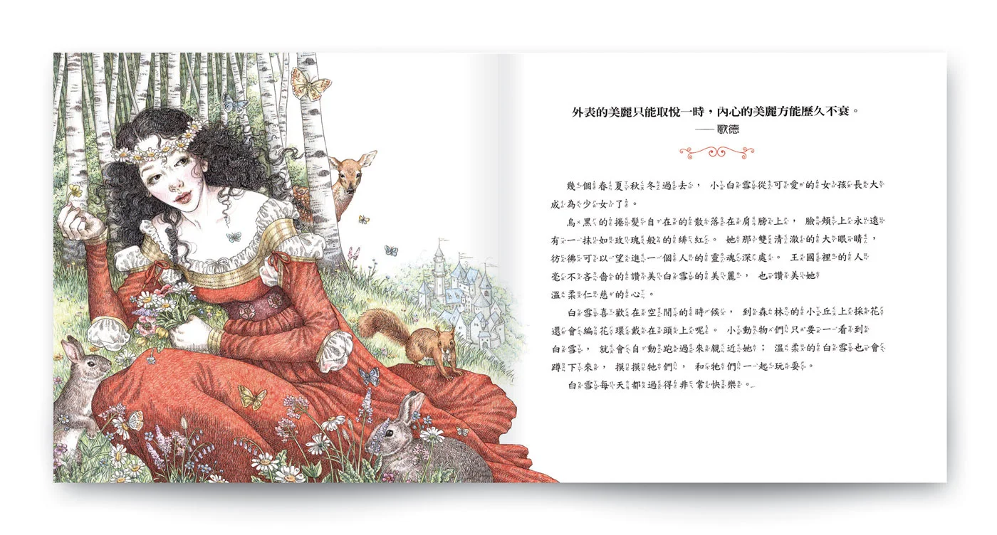
I started with a sample image of Snow white as a small girl (which eventually became the frontispiece), cheerful and confident, long before her ‘wicked stepmother’ days so that even very young readers could begin to identify with a heroine that is grown-up when the main action begins. I opted for a fairly limited colour-palette with the focus on her red gown, and set it in a vaguely medieval period that seemed to suit the story with it’s roots in old Germany. There are unwritten laws regarding time-periods and national costume attached to all fairy stories that usually hinge on where and when they were written—for example Cinderella (Charles Perrault) is almost always set in the century and country in which it was made popular, early 18th Century France.
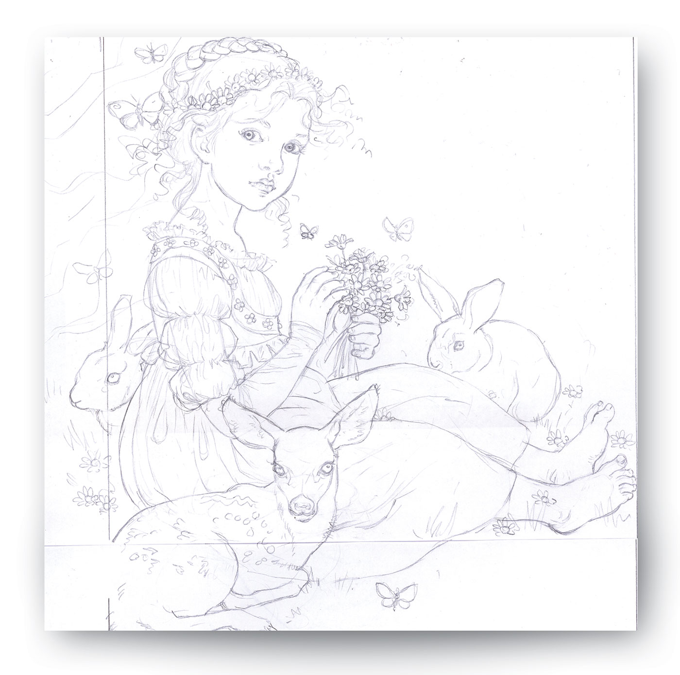

Although I was consciously ‘freeing-up’ my style I took a lot of photographs of a friend’s daughter Shannon in the role in order to maintain a lifelike likeness throughout the book—I don’t bother hiring or making costumes but dress my models in anything that bears the same shape I am looking for then add all the details in the actual illustrations. I only need a shape to work with and the way the cloth drapes the figure as it moves.

I consciously tried to make Snow White a strong, lively character, not a victim or a weakling, so that she would appeal to today’s young female readers; each generation of fairy tale books is reinvented for its new generation of readers with different self-images and aspirations which is why these books remain so vital and alive after all this time. I want my princesses and knights etc to actually inhabit their clothes and their environments so that they are believable beings that can bring the story to life.

While trying to keep the illustrations light and airy I still wanted to add all the details that add depth and interest. I can still remember how picture books captivated me as a very small child—3 or 4 years of age—and how I would sit for long periods totally lost in the details.
That’s another reason why I believe in the diversity of children’s literature and illustration and strongly disagree with the many publishers who insist that what children want is brightly coloured simplicity. My mother would buy me old books at jumble sales illustrated by masters such as Arthur Rackham, Edmund Dulac and W. Heath-Robinson so that I appreciated even at a very young age that not all colours must be vivid, that a monochromatic or a limited palette created a certain atmosphere of subtlety and intrigue. I know for certain that this is not lost on today’s children.

Arthur Rackham

Edmund Dulac

W. Heath Robinson
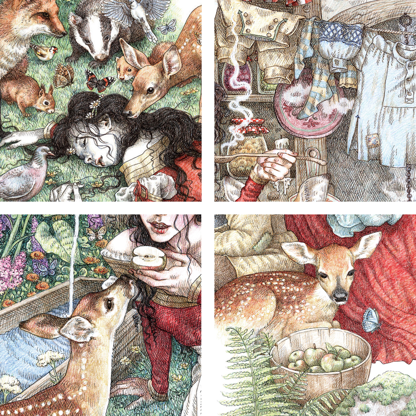
Many of the blacker, more disturbing parts of the story have been omitted from this edition by Grimm Press though I would have dearly loved to have illustrated the real version recorded by Wilhelm and Jacob Grimm (Schneewittchen as it is called). It was her real mother who wanted Snow White dead and who goes as far as to eat the wild boar’s heart and liver believing them to be her daughter’s. How I would LOVE to illustrate the original stories in all their dark goriness, I hate the fact that they have been sanitized into mere shadows of their former selves; I don’t believe they are harmful to children who are quite aware of the difference between stories and reality and do believe that grisly tales and the emotions they arouse in contrast to our actual lives are vital to our psyches. Encountering villains and their dark deeds in the safety of books and films before we are old enough to experience the world for ourselves serves as a warning that life outside the cosy confines of childhood is a dangerous place and to deprive children of the whole picture is to set them up for a great fall. Anyway—here are some of my (sanitised) Snow White spreads.


What I didn’t know at the time was that Grimm Press has a team of very talented animators and wholly believes in the relevancy of Interactive Apps in raising the levels of children’s literacy. They have been quick to surge ahead with the latest new technologies, even designing a child-friendly player for their digital Apps called ‘Telly-Bear’.

It remains my ambition to create some Apps of my own (if only I could afford an animator!) and have discussed with colleagues at great length the importance of maintaining the look and function of a moving, talking BOOK, and not becoming just an animated short. I am delighted that Grimm’s App of Snow White mirrors my own sentiments, retaining the look and feel of the words and the illustrations, adding more layers of sound and movement yet retaining the integrity of the picture book.
Nelly The Elephant (work in progress)

Those of us who spent their childhoods in the UK are very fond of a song that played repeatedly on the wireless (or radio for those younger than I am!) about an elephant that ran away from the circus. ‘Nellie the Elephant’ was recorded in 1956 and sung by the child actress Mandy Miller to a catchy tune with a rollicking chorus. It tells the story of a circus elephant who escapes to join her wild cousins in the jungle, which didn’t seem at all impossible when we were children!

http://www.youtube.com/watch?v=28Rh9zRdXxA
Unfortunately for all the real live elephants sold into, or bred for, the circus there is no escape. In recent years there have been serious and widespread attempts to educate the circus-going public about the suffering and sad existence of these and other captive animals. The internet does a sterling job of distributing painfully graphic images and animal activists devote their time and energy to agitating for an outright ban—a big hand to every one of them! Still, my inability to help even one elephant has prayed on my mind for years.

It wasn’t until I was sitting in the car with time to spare (waiting for Danny to return from a meeting), doodling idly in an old notebook that the idea for ‘Nelly’ sprang into my mind. As usual it arrived almost fully formed and I jotted down some very rough thumbnails outlining her story. I believe this is my own tiny bit of heart-felt action to open minds, especially young ones, to this sad state of affairs. I have always believed that children must be taught very early not only to love and respect other creatures but, more importantly, be aware of their precarious existence and dwindling future. Most literature for children is relentlessly cheerful and, dare I say, trivial yet I maintain that children not only need a balanced variety of literature but are happy to absorb vital information while being entertained.

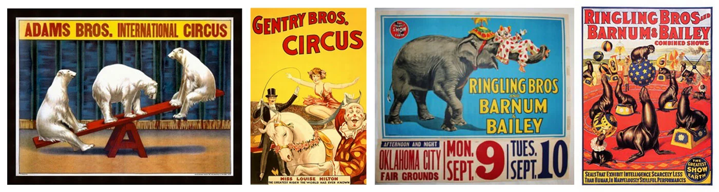
The Circus is such a historically beautiful visual theme; the costumes and the colours, the classic poster art, the carnival atmosphere—it has always been a favourite subject for children’s books and films. Years ago I produced a sample piece for a story idea that involved intricately cut paper figures in bright primary colours and though it netted no commissions it has always been a favourite of mine.

The flat colours (such a wonderful change from coloured pencils!) contrast well with the more developed areas of the illustration and in some ways harkens back to old screen-printed Circus posters.
I decided to go back to this method of illustration for ‘Nelly’, the use of strong colours being far more suited to the Circus theme than my more usual methods of working. Despite the subject matter this is still a children’s book and must be as appealing as any other to small people; it must still reflect in its graphic tone the world of the travelling Circus, the elephants must look sympathetic and friendly, the details engaging. I chose to set my Circus in the not too-distant past, in the ‘golden-age’ of carnivals and sideshows to ‘soften’ the impact of the more distressing images, the sight of shackles and the dreaded ‘bull hook’.
I began by showing Nelly safe in her mother’s womb unaware of her life to come, an image I think will appeal to small children. The colours are bright and cheerful; the clowns happy and playful—the innocent face the Circus projects to the world.

Penned in the rolling wagon at night Rosemary has given birth watched over by the rest of her troupe. Elephants are intelligent empathetic animals that care for each other and show great interest in babies born into the herd, both captive and in the wild. This is a gentle and private scene with no sense of danger or threat—no humans present!
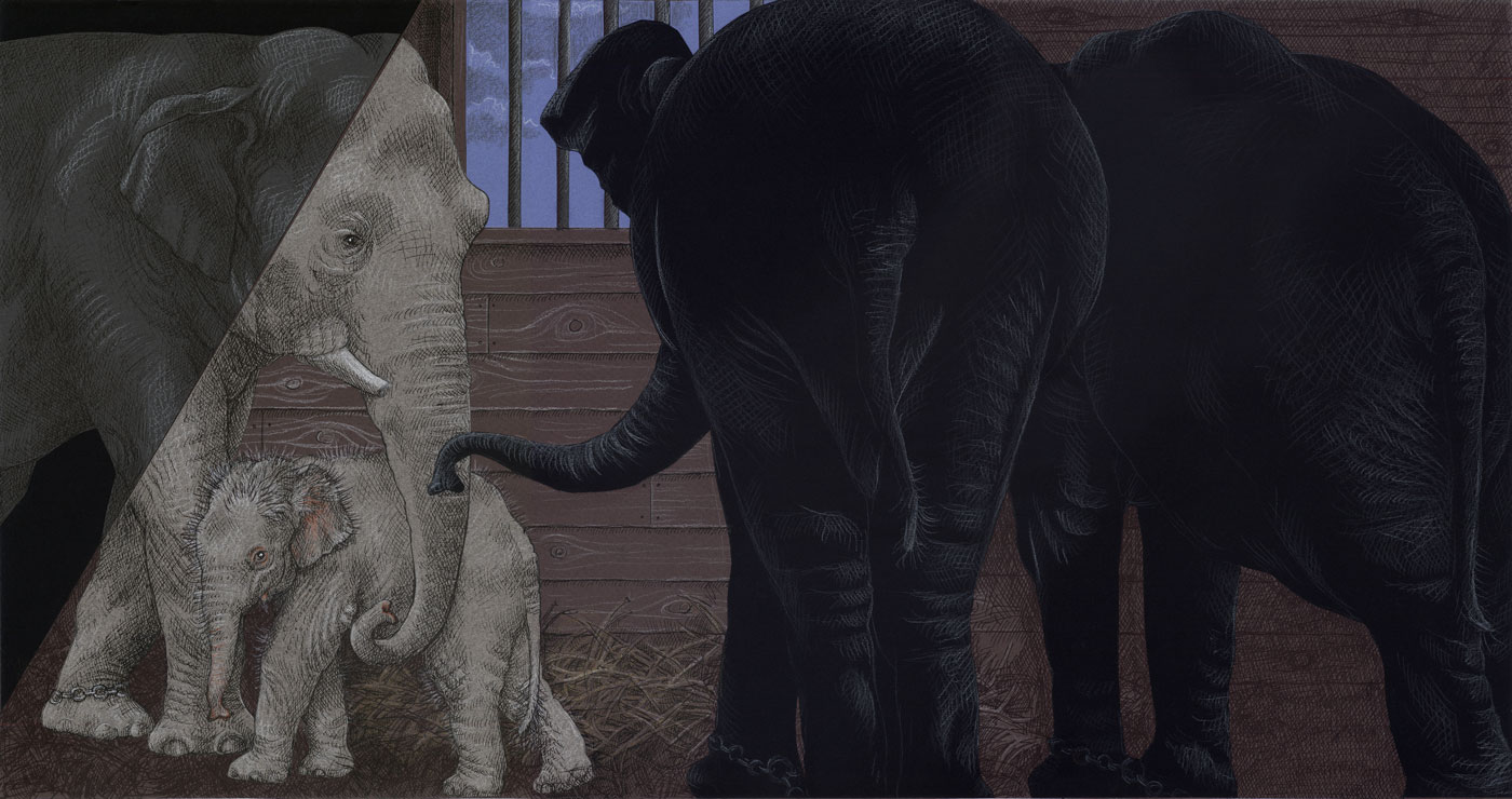
As soon as she is big enough Nelly’s fate is to be trained as a useful member of the troupe. Training young elephants for the Circus is a prolonged and cruel affair—let no one mistake this for training our pets to beg for biscuits! The animal is forced to overcome her fear and perform actions that are totally alien to natural behaviour—when did we ever see an elephant stand on her head in the wild? They do not do this willingly and a regime of force is necessary where the animal is restrained and the bull hook is used frequently and effectively.

In this latest spread Nelly’s training continues. She has grown bigger and more agile but is showing no signs of accepting her fate. She is still shackled and wearing a plain leather harness both to control her and prepare her for wearing more elaborate costumes in the future. She has learned to obey her trainer keeping a wary eye on the bull hook and at the same time aware of the cruel Ring Master. She is aware of the other captive animals going through their routines and learns to accept that humans are to be both feared and obeyed.

Once I have the line-stage organized to my satisfaction it is a matter of tracing the figures onto Canson papers, cutting and gluing—blame it on all those cutout dolls I used to make when I was a child. It’s time-consuming but really enjoyable!

After a lot of mess with glue all over the place, this is how it comes together.

Because the arc of the story is already known through the song I am writing each chapter as I illustrate it, fine tuning the words to the pictures. Now THERE’S a change!
My extremely talented husband Danny Nanos is adding his magic to each spread with his brilliant design and typography elevating my work to a much higher plain, as usual. I cannot stress too often the joy of working in tandem with someone whose sense of aesthetics and design compliments my illustrations so wonderfully well!

I hope to have more illustrations of ‘Nelly’ to show you in the not too distant future.
October 3 2013
DRACULA (Templar Publishing ISBN 978-1-84011-571-0)

I had wanted for years to illustrate Dracula-----however, type-caste by my use of coloured pencils to draw endless princesses and dragons, no one would look at me when it came to ‘darker’ subject matter. Imagine my joy when Mike Jolley at Templar rang me to ask whether or not I’d be interested!
For me Dracula is a love story, not so much a vicious creature of the night, more a tormented loner looking for love the only way he knew how. He was always going to be the Byronic anti-hero of my book rather than the depraved monster of legend. I had tackled similar subject matter before which had mostly gone unnoticed----years ago a friend posed for a vampire from the middle-east which appeared in Time-Life Books, and more recently I had produced a sample-piece based on ‘The Bride of Frankenstein’. I will be forever grateful to Mike Jolley who showed great faith in my abilities, previously untried, by offering me this book.

When I am offered a new book I always take it upon myself to produce a sample in which I explore the nuances of mood and colour and where I decide on the overall style. The drawback to coloured pencils (one of many, that is) is the inability to make strong dark colours---particularly black, so my first thought was to use acrylics. I have always said I am a drawer rather than a painter so it wasn’t an easy decision. I produced the sample below concentrating on the atmosphere of repressed eroticism and the idea of forbidden love----she is wrapped in her grave clothes but it is unclear whether she is dead or undead, but passive in the manner of Victorian womanhood.

The painting was greeted with general approval but the Templar crew wanted to explore alternate approaches before committing themselves so I took the same image and translated it into pencil. It was far too pallid so I went over it with a drawing pen, which added strength and (added benefit) gave almost the appearance of an old etching. This style seemed to fit the narrative and gave me the opportunity to add more detail so I decided to explore it further.

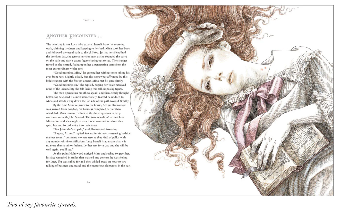
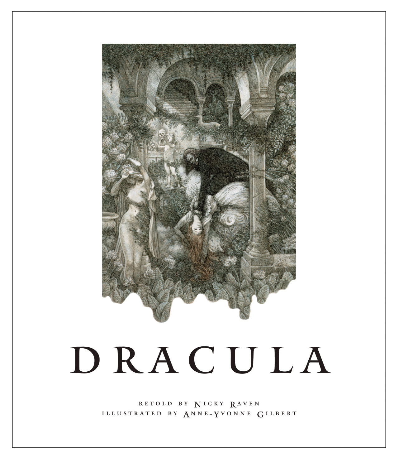
The true test of whether the pen and ink were the most suitable medium was to pull back from the figures and illustrate more of the setting. I wanted the background to the illustrations to be very lush and Gothic to emphasize both the ‘romantic’ aspects of the tale and the busily ornate Victorian era in which it is set, so I placed Dracula in an Italianate night garden amongst marble statues and trailing foliage. (At this point Dracula had long black hair as I had not received Nicky Raven’s manuscript.)

When we received the script (at this point it was decided that my husband, graphic designer Danny Nanos, would design the book) the first thing we noted was that Dracula was described as having long white hair and violet eyes------perfect, as we had already discussed avoiding wherever possible the usual red and black associated with the book! I started sketching immediately------I wanted to make him lean and hungry looking yet still attractive in an unconventional manner. (I have attached some of those initial sketches below.) I also chose not to use real people for reference as A.) I couldn’t find anyone who looked the way I imagined him and B.) I thought it would restrict the freedom I had to imagine the scenes.

This was the second time Danny and I had been commissioned to work on a book together and it made the experience one of mutual creativity and inspiration. We have a similar sense of aesthetics, both like to pare things to their essential elements; both are interested in exploring new ways to work. Danny’s love for typography informs all his work---he is inclined towards the spare and elegant emphasized by his use of white space. Working in the studio side-by-side enabled us to create the spreads together, passing them backwards and forwards, adding and subtracting in a way that would be normally impossible between an illustrator and a designer working in the usual way.

Together we created a visual language that became the voice of the project. Analyzing the essentials of the story the three main themes are love, death and fear and we felt we should not draw back from depicting any of these----however, to our disappointment, many of our original ideas were either deleted or watered down in deference to the younger readers. (I have attached some of our deleted spreads below). I still wonder why this type of censorship is necessary; though living in a far more repressed society than we inhabit the Victorians still felt free to depict nudity, religion and violence in even their children’s books. Have a look at Rackham and Dulac and Heath Robinson.

Even once the book was planned many of the spreads continued to evolve
as we worked on them. We both like to employ nuances and subtleties, for
instance, the wind blowing the type or lightening striking through it.

After scanning-in the illustrations and laying the type one or other of us would often suggest adding another layer to either the foreground or the background, adjusting the illustrations and text accordingly. A style unique to this project evolved as we worked----the directness of the design had a traditional quality to it whereas the simplicity of the drawings had a fresher, more contemporary feel to them and the two combined succeeded in interpreting Dracula in a completely new way. I enjoyed the whole project immensely and discovered a new freedom to illustrate which was deeply satisfying. Working together we felt able to try anything new that occurred to us, our only constraint being the ultimate deadline. Another point---although I do all my illustration the old-fashioned way with paper and pencils I discovered that computers are marvelous tools, for instance we were able to ‘ghost’ images with great subtlety, adding interesting layers to the pages quickly and efficiently.

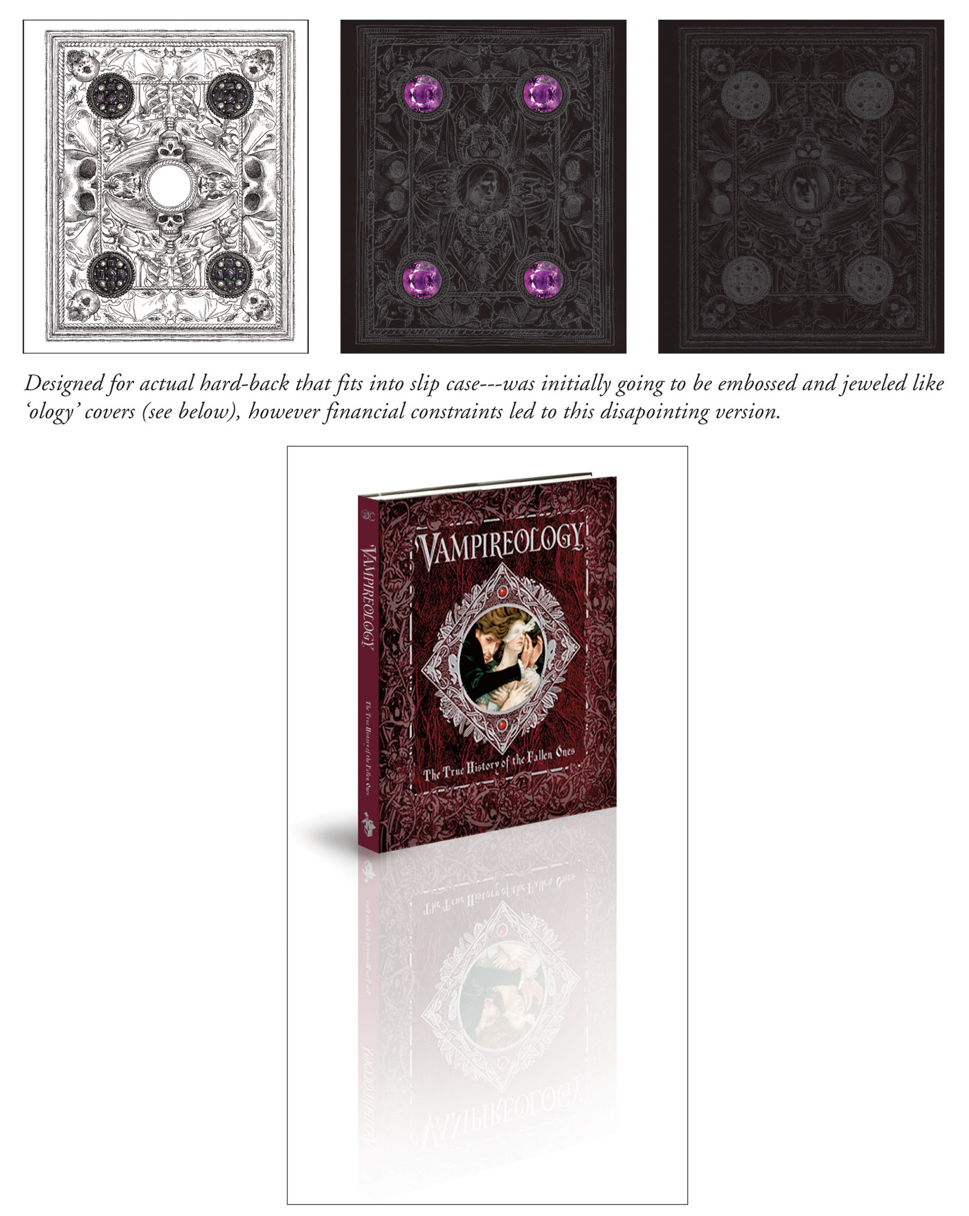
I feel I should talk more about the cover. Neither Danny nor I thought the cover should have the colour red anywhere near it. The colour of Dracula’s hair and eyes, according to Nicky Raven, informed the whole book and we therefore felt the cover should stick to the same tones. There was to be a slipcover bearing illustration and type and the book itself was to have an embossed hardcover studded with purple jewels like the famous ‘ology’ books. We presented many designs for the slipcover and a detailed drawing for the embossing. Disappointingly the embossing and jewels fell by the wayside and all that remains is a subtle hint of what it could have been.
And the cover became a bone of contention as it was reported to us that the booksellers insisted that all Draculas had to be red, this obeying some kind of law, and that our designs must be altered accordingly. We were very disappointed by this and tried to make the red as UN-red as we possibly could but still wish we could have changed it.

Danny decided to use the original sample of Dracula in the garden for the frontispiece with a bit of digital manipulation to alter the black hair (not to mention the nudity of the statues!).
My one great regret with this book is that they never made it into an app. It cries out for an eerie soundtrack and some subtle animation, it would work superbly! Who knows----they might change their minds.
Rashomon
As this is my first ever blog posting I wondered what on earth I should write about ------do I have anything interesting to say? Then I thought about my experience as an illustrator for 35+years and decided to just write about that. What I am working on, how I did it, and what my thought processes were. So here’s my first post----it’s a new book that I am very proud of, for Grimm Press in Taiwan----a new version of ‘Rashomon’.

Initially made famous by Akira Kurosawa’s 1950 film based on two stories by Ryunosuke Akutagawa (‘Rashomon’ and ‘In a Grove’), it is has a plot device that uses various characters to recount different versions of a violent event. It has a rape, a murder, a ghost and plenty of dead bodies------a little different from the fairies, princesses and knights I am often asked to illustrate!

I was very excited to be offered this commission, not only by the setting of ancient Japan, but also by the dramatic story-line that allowed me to explore a different side to my work. (As I usually work with coloured pencils I am often typecast as an illustrator of softer, more romantic subjects; something I have always fought against.) I have been fascinated by Japanese prints since my youth and decided to approach ‘Rashomon’ with these in mind knowing their strong colours and graphic nature would be well suited to the gruesome subject matter. (I particularly liked Kuniyoshi’s skeletons and used a version of these as my ghost.)
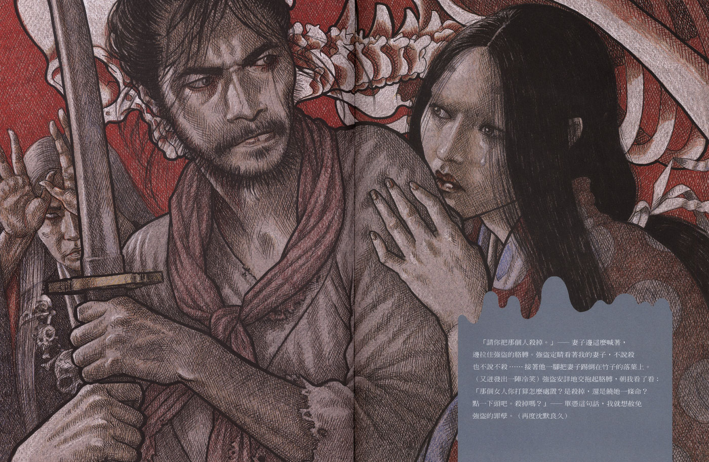
Also, when it came to where to put the type I noticed that a lot of the Japanese printmakers would add a scroll or banner on top of the image to contain the written information and so I decided to employ this device.

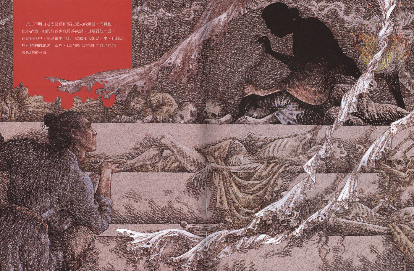
Researching the actual ‘Rashomon’ gate (which was an old city gate of Kyoto fallen into ruin) was quite challenging as there is very little evidence of what it looked like therefore I kept mine pretty vague and atmospheric, giving a shadowy impression of pillars and falling timbers. At the start of Grimm’s version a young man shelters in the ruin during a storm and comes across an old crone kneeling in the dark, plucking the hairs from a corpse----the building being used as a dumping ground for the city’s dead.

To achieve a more graphic appearance to the spreads I chose not to photograph real people as I usually would, but based my figures loosely on film stills and my imagination, drawing them in a fairly free manner using bold lines and colour. It did make me very nervous being so experimental-----the only other book that I have attempted to work on without taking my own reference pictures was ‘Dracula’ (for Templar Publishing). Having so little to work from did liberate my drawing from too much fuss and forced me to make bigger, bolder strokes rather than get hung up on finer details.


Recently I have begun varying my techniques more and more and found that I can work more freely and make bolder marks by using thick Canson papers and working with marker pens on top of coloured pencil. Forcing myself to use thick black lines has changed my style and allowed me tremendous freedom. I would never advise an illustrator to use an experimental style on an actual commission but the older I get the more I find it rewarding to take these risks. At the age of 62 I think I am just coming into my creativity!
